Talking Statues Contact
Design
The area of design relates to the project’s visual appearance and includes how the app and signs should look, among other things. It also involves functionality. Therefore, design becomes a fusion of appearance and functionality.
The signage
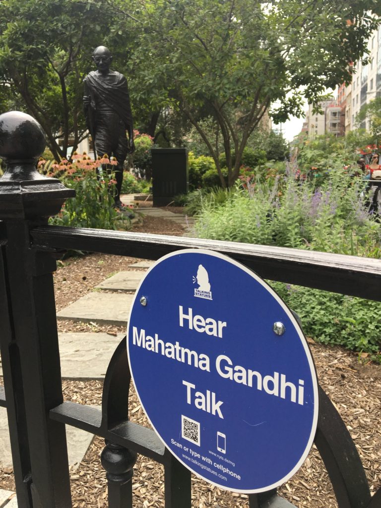
Our sign design is the result of several years of meticulous development. The signs can be customized exactly as you wish in terms of color, shape, and lettering. The signs fulfill a dual purpose—effectively communicating information while maintaining an aesthetic appeal that blends into public spaces without causing any disruption. The signs, with a diameter of 8-10 centimeters, often meet the requirements of most locations where the project takes place.
The signs are also the project’s means of advertising and are necessary to both attract attention and to get people to use the installation. The signs create curiosity and at the same time highlight what can be expected from the installation. While adhering to the aforementioned principles of functionality and environmental respect, there is flexibility to create diverse designs. However, it is essential to consider the function of the signs and ensure their compatibility with the surrounding environment.

Sign Material and Mounting Options

Regarding the material used for the signs, most times our team utilizes Dibond, which is an aluminum composite sheet comprising of two 0.3 mm thick aluminum cover layers and a polyethylene or mineral core. Dibond is lightweight yet exceptionally rigid and strong, making it well-suited for both indoor and outdoor sign mounting.
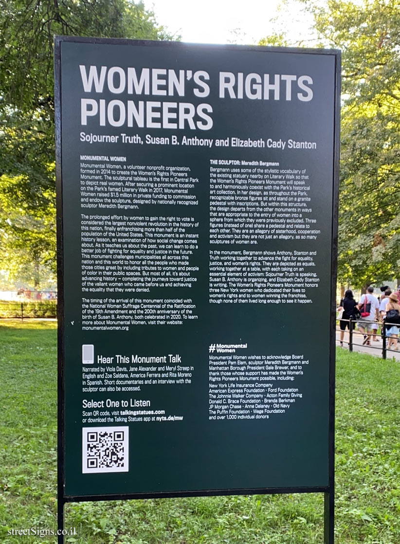
The signs can be mounted in various ways. The most common method involves using double-sided tape, which protects the statue plinth. In certain cases, we also mount signs on fences or utilize large stickers placed on the ground. The placement and design of signs are always tailored to the specific location, ensuring the best possible effect in all aspects.
The Talking Statue App

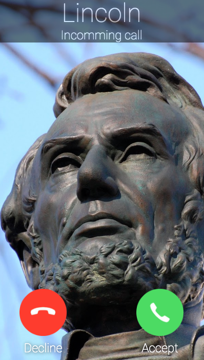
It is our custom to incorporate two images of the statue within the app when it comes to the design. The first image appears to allow the user to see who is calling, while the second image appears upon app launch to further enhance the visual appeal of the Talking Statue experience. We can also adjust color, lettering, and even the ring tone according to your preferences.
The last page that appears on the app screen after the statue completes its monologue is used to credit the contributors, actors, writers, and organizers of the Talking Statue project. In some cases, we can incorporate logos and website links. For added intrigue, an optional question mark can be included at the end.
The app utilizes a technical feature known as a WebView, which makes the incoming call to the user. While it mimics a traditional phone call, it operates within the app framework, so it is really not a real phone call.
During the call screen stage, much of the design skill lies in finding the right image to display when the statue calls and deciding on colors and lettering.
The design template in the app is hosted online and cannot be damaged. Additionally, you can control it online and make immediate changes, for example, adding a new monologue within seconds. The app also works on all smartphone models and is transmitted through the internet.
